Lovendr

All natural beauty products

Overview

Role and Contributions:
Market Research, Interview, Competitive Analysis, Ideation, UI Design, UX Design, Usability Testing, Prototyping

Tools:
Figma

Sector:
E-commerce Website, Retail

Problem

Users struggled to find different soap categories due to poor product discoverability and navigation issues, leading to frustration and confusion during their shopping experience.

User Pain Points:

  • Only two soap products were immediately visible, making it seem like there were no other options.
  • Other soap categories were represented by unclear icons, making them hard to identify or click.
  • Clicking the front image led to an error page, causing frustration and drop-offs.

01. Discovery

The Challenge

The homepage only displayed two products, leading users to believe that no additional options existed. Other product categories were represented by icons that were vague and difficult to recognize, which made it hard for users to navigate to the full product list. Additionally, the main banner image was misleading, as it appeared clickable but instead led to an error page, disrupting the shopping experience.

This confusing layout and navigation issues led to user frustration, higher bounce rates, and lost sales, as many users abandoned the website before discovering the full product selection.

I believed that improving product discoverability through a better visual hierarchy, clearer category labeling, and fixing navigation errors would enhance the user experience and boost conversions

To address this issue, the following UX improvements were proposed:
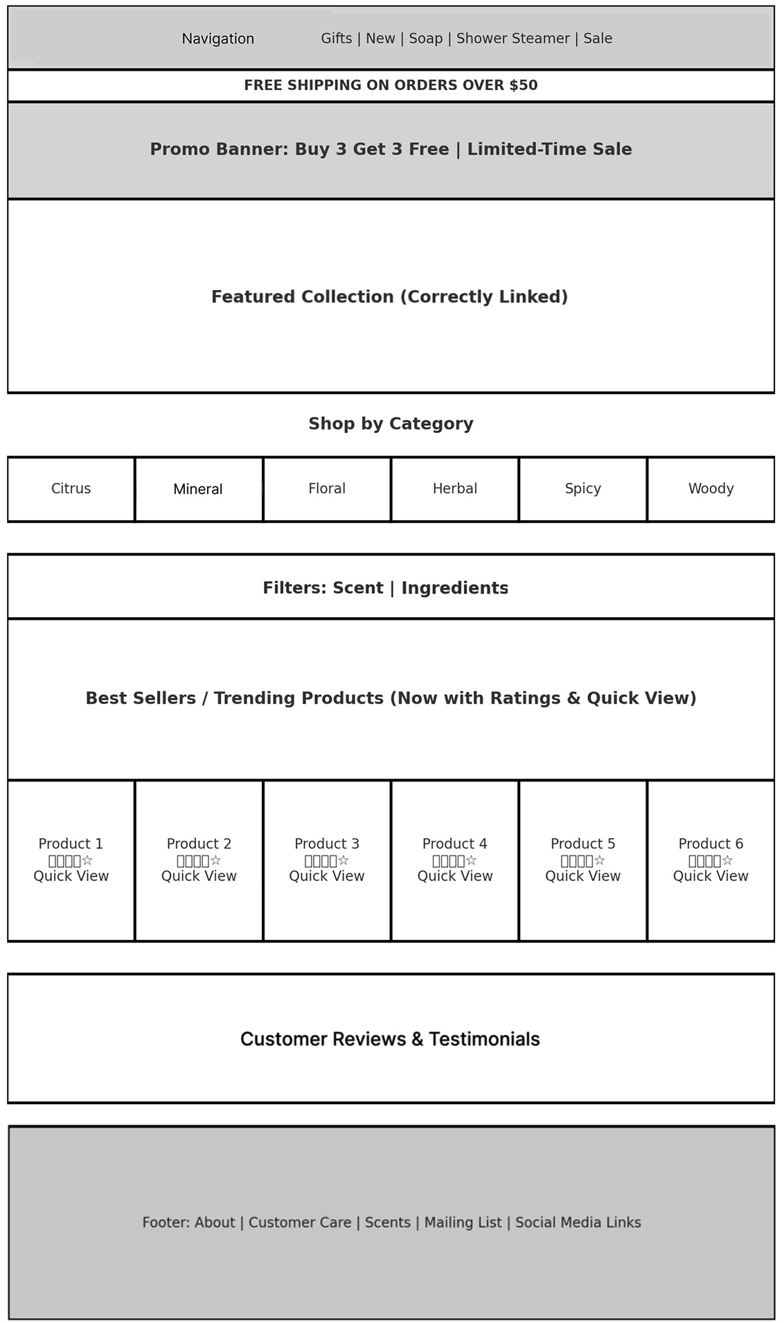
  • Revamp the product grid to display all categories upfront instead of limiting users to two visible products.
  • Replace category icons with real product images to improve recognition and clickability.
  • Ensure the homepage’s main image correctly links to product collections instead of leading to an error page.
  • Introduce filtering options such as scent and ingredients to help users quickly find products that match their preferences.
  • Add a search bar to further enhance product discovery.

By implementing these user-centered design enhancements, I aimed to increase engagement, reduce bounce rates, and improve overall usability, ultimately leading to higher sales conversions.

User Research Methods

  • User Interviews: Conducted sessions with users to understand their frustrations with the current product navigation.
  • Session Recordings & Heatmaps: Used analytics tools to track user behavior, identifying pain points such as where users dropped off.
  • Competitive Analysis: Studied how other e-commerce soap brands structured product listings to optimize discoverability.

02. Define

Key Findings

  • 70% of users assumed the website only had two products because additional options were not visible.
  • Users struggled to recognize category icons—click data showed low engagement with these elements.
  • 85% of users expected the homepage banner image to be clickable and link to products but encountered an error page instead.
  • Filtering options were requested by 65% of users, as they wanted to browse by scent, or ingredients.

Persona

  1. Ingredient-Conscious Shopper: Prefers all-natural soaps and wants to find products with specific ingredients for sensitive skin.
  2. Gift Buyer: Looks for premium soap sets for gifting but struggles with product visibility.
  3. Eco-Conscious Consumer: Prioritizes sustainable and cruelty-free soaps but finds it difficult to identify eco-friendly options.

03. Develop

Ideation

  • Grid-Based Product Layout: Displaying all categories upfront for better visibility.
  • Clickable Category Images: Replacing vague icons with real product images to improve recognition.
  • Enhanced Navigation Flow: Fixing broken homepage banner links and improving click paths.
  • Smart Filtering Options: Allowing users to sort products by scent, skin type, and ingredients.

Wireframes and User Testing

  • Created multiple product discovery prototypes to test navigation improvements.
  • Conducted usability testing with 12 users to evaluate effectiveness.
  • Compared grid-based product layouts vs. the original two-product display.

04. Deliver

Final Design Features

  • Users can now easily browse all soap categories.
  • Icons and product images are clear and intuitive.
  • Navigation issues are fixed, ensuring a seamless shopping experience.

Usability Testing

  • Task Completion Rate: Improved from 40% → 90% (Users successfully found different soap categories).
  • User Satisfaction Score: Increased from 3.2 → 4.7/5 (Users found navigation much easier).
  • Bounce Rate Reduction: Error page clicks dropped by 85%, leading to improved engagement.

05. Reflection

Product Visibility Matters: Displaying all product categories upfront significantly improved user engagement and reduced bounce rates.

User-Centered Navigation Wins: Replacing vague icons with real product images increased category interaction and helped users find products faster.

UX is an Ongoing Process: Continuous A/B testing and user feedback will help refine navigation and filtering for an even better shopping experience.

By addressing these key usability challenges, Lovendr enhanced product discoverability, leading to a smoother browsing experience and increased conversions.

San Francisco Bay Area

T: 541 499 1827
[email protected]