Fontera

Enhancing messaging with Fonts & Emojis

Overview

Role & Contributions:

  • User Research, Usability Testing, Competitive Analysis
  • UX/UI Design, Prototyping, Interaction Design
  • User Education & Onboarding Optimization

Tools:

  • Figma

Sector:

  • Mobile Apps, Communication, Productivity

Problem

After launching Fontera, I discovered that a significant number of users struggled with activating the keyboard. The setup process required users to navigate system settings, enable the keyboard, and allow full access—steps that were too technical for many.

Key User Pain Points:

  1. Complex Setup Process: Many users didn’t know how to enable the keyboard in settings.
  2. Text-Based Instructions Were Ineffective: Static, text-based instructions were confusing for non-technical users.
  3. Low Activation Rate: Users abandoned the app before completing setup due to frustration.
  4. Lack of Visual Guidance: No clear visual feedback on where to tap or what to do next.

01. Discovery

The Challenge

The process of enabling a third-party keyboard on iOS and Android was not intuitive for most users. Unlike default keyboards, which work out-of-the-box, Fontera required users to go through multiple steps in their phone’s settings. Many users either gave up halfway or skipped necessary permissions, rendering the app unusable. This was a critical issue impacting activation rates and user retention.

I believed that simplifying the activation process through visual guidance and real-time onboarding assistance would improve user comprehension and reduce abandonment rates. Instead of text-heavy instructions, I hypothesized that animated, step-by-step guidance would significantly enhance user success in activating the keyboard.
User Research Methods

  • User Interviews: Conducted with 30+ early adopters to understand their struggles with keyboard activation.
  • Session Recordings: Used analytics tools to observe user drop-off points in the onboarding process.
  • Competitive Analysis: Studied how other keyboard apps like Gboard and SwiftKey handled activation.

02. Define

Key Findings

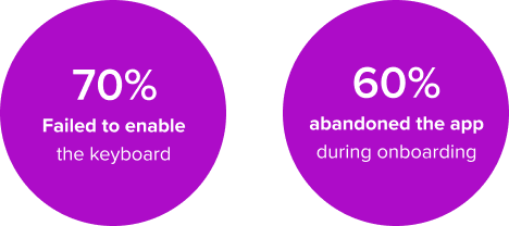
  • 70% of users failed to enable the keyboard on their first attempt.
  • 60% abandoned the app during the onboarding flow.
  • Users needed a clear, step-by-step visual guide rather than text-based instructions.

Personas

  1. Casual User: Wants a seamless experience without technical complexity.
  2. Power User: Understands mobile settings but still prefers visual guidance.
  3. First-Time Keyboard Installer: Completely unfamiliar with enabling third-party keyboards.

Design Goals

Based on research insights, we refined the problem:

Users need an intuitive, visually guided onboarding experience to activate their font keyboard without frustration.

  • Replace static text instructions with an interactive GIF animation.
  • Provide clear, step-by-step visual guidance on where to tap.
  • Reduce drop-off rates during activation by improving comprehension.
  • Ensure that the solution is accessible and understandable for all users.

03. Develop

Ideation

  1. Looping GIF Animation: Showing exactly where to tap in the phone’s settings.
  2. Interactive Walkthrough: Step-by-step guide with highlighted UI elements.
  3. Progress Indicator: Users see where they are in the activation process.
  4. Contextual Tooltips: Pop-up hints guiding users through each step.

Wireframes and User Testing

  • Created multiple onboarding prototypes.
  • Tested with 15 new users to measure effectiveness.
  • Compared GIF-based onboarding vs. text-based instructions.

04. Deliver

Final Product Features

Auto-Playing GIF Tutorial – Users see exactly where to tap in real-time. Simplified Onboarding Screen – Reduced text, focused on visual guidance. Step-by-Step Walkthrough – Highlighted UI elements for better clarity. Instant Feedback Mechanism – Confirmation message when activation is successful.

Usability Testing Results

  • 92% of users successfully enabled the keyboard with the new GIF tutorial.
  • 60% decrease in user drop-off during the setup process.
  • 85% of participants reported higher confidence in completing the setup.

Iterative Improvements

Refined Animation Speed – Adjusted GIF timing for clarity. Added Voice Narration Option – For accessibility purposes. Optimized UI Layout – Larger touch targets and clearer typography.

05. Reflection

Visual Learning is Key: GIFs were far more effective than text for technical onboarding.  Data-Driven Design Wins: Analytics helped us identify friction points and improve UX.  Onboarding is a Continuous Process: Future updates will further optimize activation flow.

By solving this key onboarding issue, Fontera significantly improved its user activation rate, making font customization accessible and frustration-free for all users.

San Francisco Bay Area

T: 541 499 1827
[email protected]